
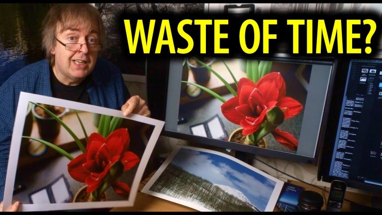
Can you actually judge print quality on a YouTube video? I was recently asked if my printing tutorials and paper reviews are a “waste of time” because of the technical limitations of video colour management and 1080p resolution.
In this video, I’m sharing the honest truth about the limitations of showing physical prints on screen and why high-end photo printing requires a hands-on approach.
What we cover:
– The Problem with Colour Management on YouTube: Why what you see on your screen isn’t what I see in my studio.
– 1080p vs 4K for Printing Videos: Does resolution actually help you see print detail?
– Why I don’t do online print training: The importance of holding, lighting, and viewing a print in person.
– Judging Photo Paper Quality: How to use known test images to understand your own printer’s output.
– The True Value of Print Reviews: If you can’t see the detail, why watch?
Whether you use an Epson ET-8550, a Canon PRO-1100, or are just getting started with colour management and ICC profiles, understanding these “video fixes” is essential for improving your own printing workflow.
Resources mentioned:
Download my Northlight Images Test Images: https://www.northlight-images.co.uk/printer-test-images/
All my ICC printer profiles for better printing: https://www.northlight-images.co.uk/keith-cooper-printer-profiles/
My latest paper reviews: https://www.northlight-images.co.uk/keith-coopers-paper-reviews/
If you’ve found YouTube printing advice helpful—or frustrating—let me know in the comments!
#PhotoPrinting #FineArtPrinting #ColorManagement #PhotographyTips #PrintQuality #EpsonPrinting #CanonPro1100
0:00 Is this video a waste of time?
0:45 The fundamental limit of video vs. print
1:35 How I “fix” lighting to match my screen
2:20 Why video comparisons are often misleading
3:10 The importance of physical handling and scale
3:55 Why I’ll never stop making printing videos
4:45 How to use my judgment for your own prints
5:15 Office update and final thoughts
For a full categorised index of all my videos, see:
https://www.northlight-images.co.uk/keith-cooper-photography-videos-index/
—————–
If you’d like to make a small donation, I have a Kofi page:
“Buy me a coffee” https://ko-fi.com/keithcooper
—————–
My articles and videos are always free to access.
Any help with running this channel is gratefully received.
—————–
I also have some affiliate links which earn me a commission if used.
US Amazon photo/print gear: https://amzn.to/3l9vJC6
B&H Photo: https://www.bhphotovideo.com/?BI=2008&KBID=2711&DFF=d10-v1-t8-x4
Adorama: https://www.adorama.com/?utm_source=rflaid64416&utm_medium=affiliate
TIME brings unparalleled insight, access and authority to the news… A 24/7 news publication with more than a century of experience…get closer to the world of entertainment and celebrity news as TIME gives you access and insight on the people who make what you watch, read and share…brought to you by SloppBoxx.Com.


A question to viewers… What sorts of printing advice and testing would you find most helpful? Questions always welcome! Free test images are at https://www.northlight-images.co.uk/printer-test-images/ If you’d like to make a small donation towards my testing, I have a Kofi page: “Buy me a coffee” https://ko-fi.com/keithcooper My bespoke training is covered at: https://www.northlight-images.co.uk/commercial-photography/training/ I’m also available as a speaker at conferences and photography events. All my current standard profiles are listed via https://www.northlight-images.co.uk/keith-cooper-printer-profiles/ All I ask for the profiles is a Ko-Fi donation
Don’t stop!!!
I won’t be…
Hi Keith, I find this very helpful, as you offer recommendations based on your extensive experience. It definitely saves a lot of time and, ultimately, money too.👌👍
Glad they help – thanks
With broadcast television it was realized by the industry that references were needed to adjust color television to be what was broadcast, rather than just guessing. VITS was created to send references to television sets tuned to the broadcast. Granted you could still adjust your TV to what you wanted the screen to look like, but now it was based upon a reference built into the signal.
It might be time that cameras create a reference so that colors stay synchronized through the printing process. Yes, there are the text files that can be created which someone processing the photo can use. I am talking about a water marking standard that adds calibration markers to the photo inside the actual photo. Those who wish to edit their photos can still do so, but everything is calibrated to a standard. The problem with VITS was that it over saturated the chroma and it needed to be backed down with the television sets own controls, however it did tell the sets what the various colors should be based upon. The same would be true with a monitor and printing. It would still allow for post editing but everything would be calibrated to a standard so that an accurate representation of the photo can be recreated. The monitor and printer would know how to adjust settings so that the picture and print are calibrated to a specific standard which allows for more accurate replication instead of a best guess. Think of it as calibrating white balance so everything is adjust to the same standards.
Thanks – even then it would be hard pushed to show the kinds of differences I’m looking at with prints – that and my video making is at a rudimentary level [even before YT gets its hands on it]
Your youtube videos are good for learning how to print. One can not really evaluate a print on a computer screen, There is a marketer that compares papers on youtube and it is useless because one can not tell the difference between papers
Thanks – yes, showing differences is a forlorn task. Sometimes in person, even when the papers are on the desk in front of me..
I recently got my first color-printer after watching your videos for a long time. I got a *very* cheap 2nd hand printer, because it was broken, for free. I fixed it an now I am in the learning phase.
Let me tell you, this cheap Canon TS33xx-series (CMY PigmentBlack) thing is already mind-blowingly good!
It is absolutely not a perfect printer, in no way shape or form.
However I am gobsmacked by the prints I did already get out of it and how my learning curve evolves thanks to your knowledge.
My advice for anyone who complains about YT being useless for judging print quality: get the cheapest printer and test how good your skill level is in maxing out the performance you can get from a cheap piece of junk!
AFTER that you can certainly nerd out about more inks, pigment vs. dye, etc.
You don’t need to (maybe even *must* not) spend terrible amounts of money.
However, you absolutely *have* to put the time into making better prints. Complaining about not being able to compare from a YT video IS the completely wrong way to approach printing.
Keith, your videos are a treasure trove of useful knowledge about printing!
Sharing your knowledge is so so appreciated.
Cheers
Thanks – yes, making prints and looking at them is the only real way…
Keith, you’ve garnered my trust in your good work. There is no doubt my prints have improved immensely from your postings online and in YouTube. When I meet with a prospective client, I don’t show up with a tablet to show them what prints will look like on screen. I now carry a printed portfolio in a clamshell organizer so they can see the individual images in reflected light and how they look on different types of paper. It makes a difference. Thank you! You asked for ideas for the future. I’d like to hear your thoughts on print portfolios and presentation methods.